A major project for SINTEGRA
We are pleased to unveil the complete overhaul of our visual identity and website.
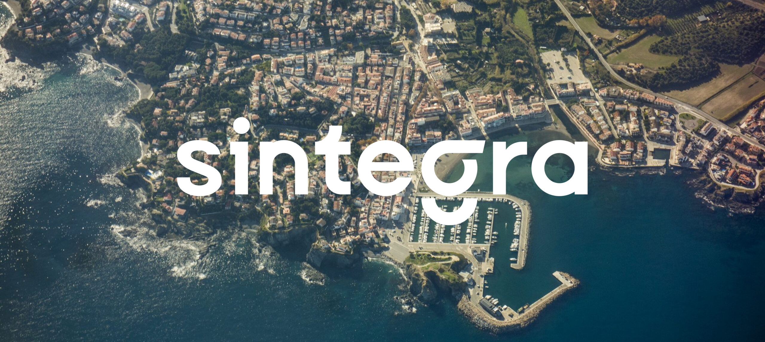
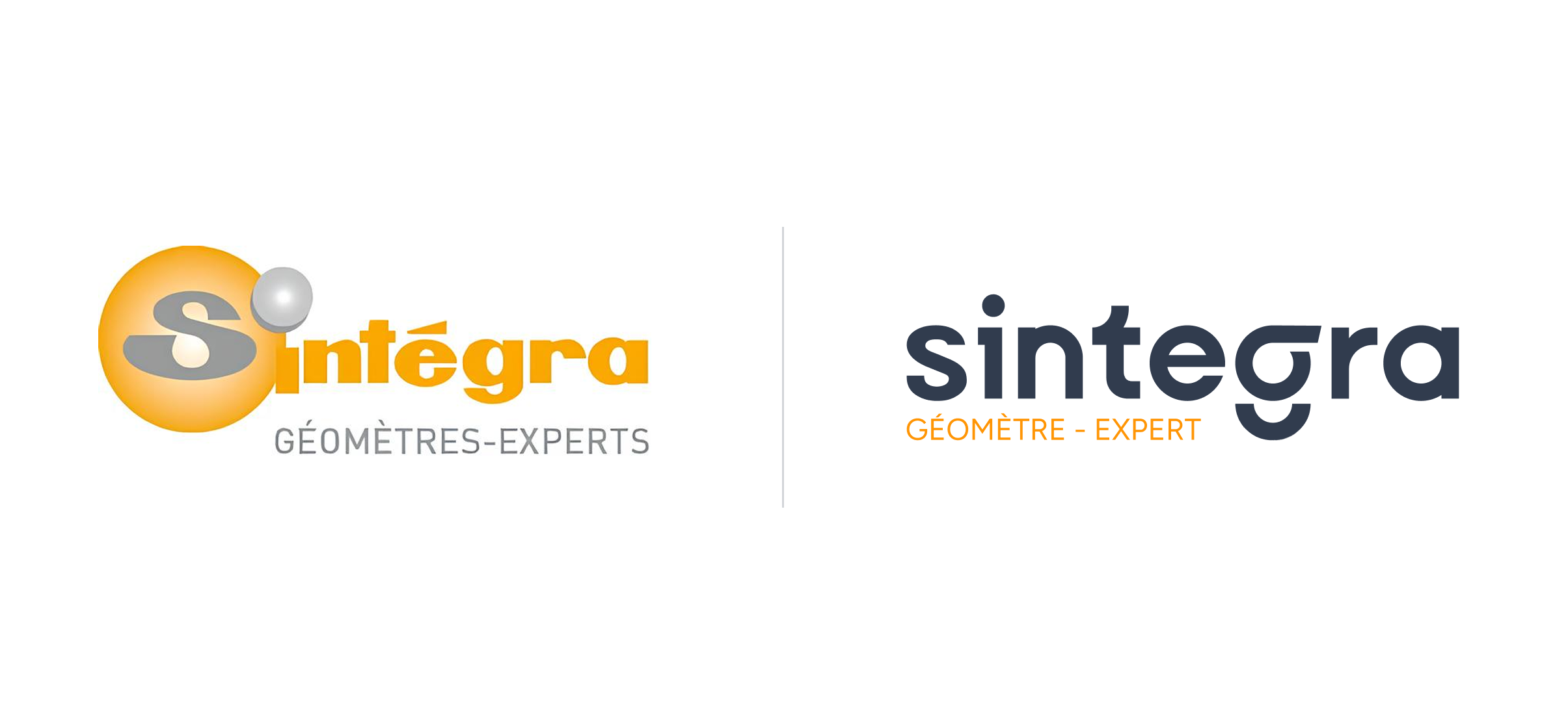
This development marks an important turning point for SINTEGRA. It reflects our desire to modernize our image while remaining true to our core values. This graphic redesign, the most important since our creation, symbolizes our ongoing commitment to innovate and adapt to change, while putting people at the heart of our approach.
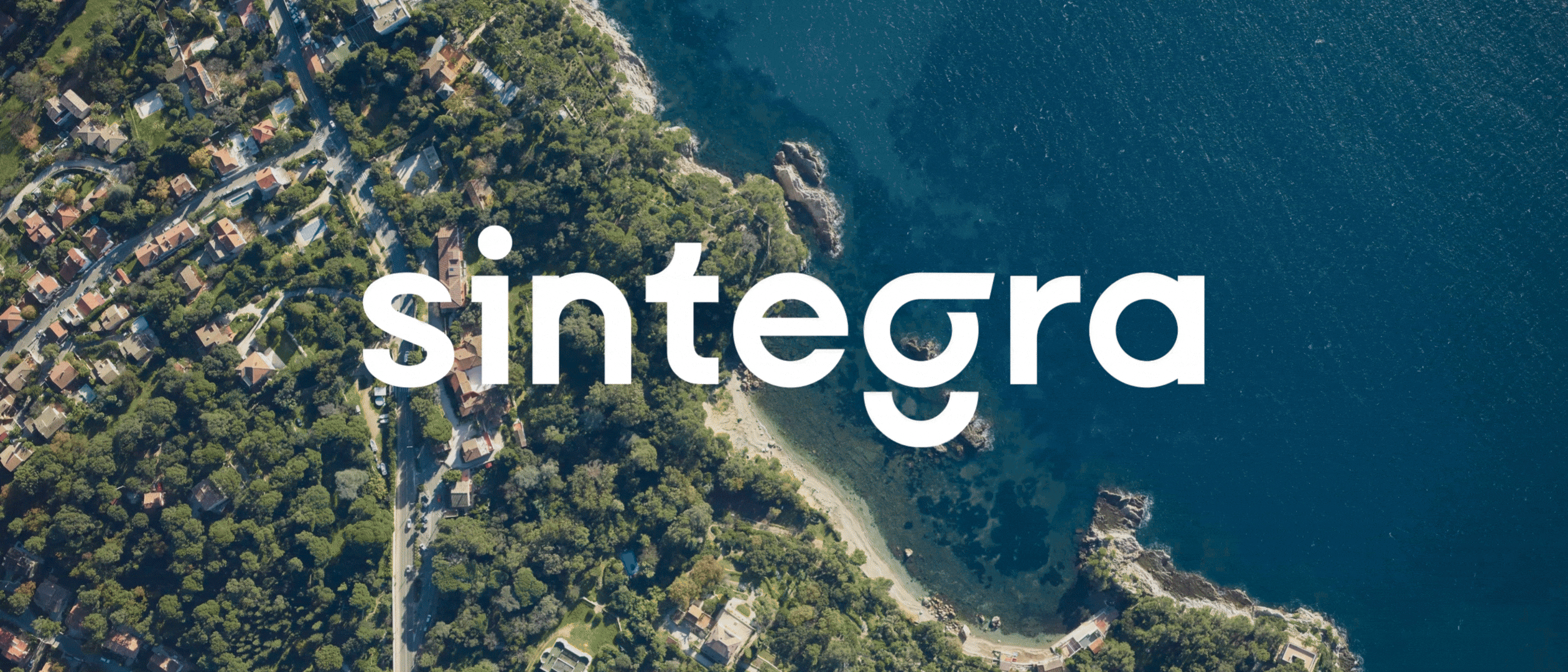
A new visual identity: Between continuity and innovation
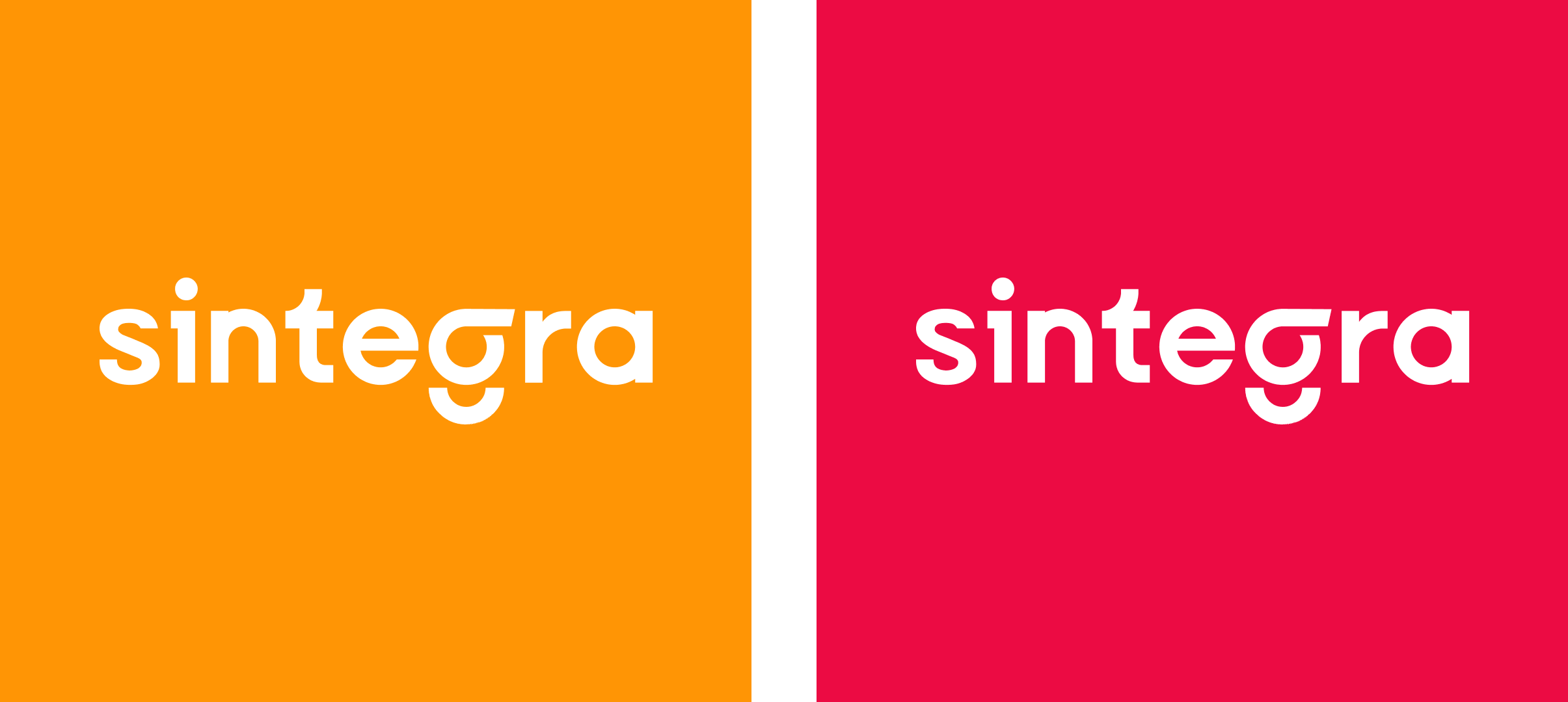
One of the most striking features of our new charter is the conservation of orange. We’ve revitalized our iconic color to make it more vibrant, reflecting our commitment and energy. To add a touch of dynamism, we’ve introduced a new color: raspberry. Lively and energetic, this shade illustrates our creativity in every project.
The new graphic charter is not limited to colors. We also defined typography and graphic elements consistent with our visual identity. Each element has been carefully chosen to ensure visual harmony with the GEOFIT Group, following our merger in 2024.
A new, intuitive website: the fruit of co-construction
Our new website has been designed to offer a fluid and pleasant user experience, with intuitive navigation and a bright design. This project is the fruit of a genuine co-construction, enriched by the contributions of numerous employees.
The site is structured so that you can easily find what you’re looking for, whether it’s our expertise, our news or our history. Each section has been carefully organized to ensure fast, efficient access to essential information.
We’ve come a long way since our first website went online in 2003.

Nous sommes fiers de vous révéler aujourd’hui cette nouvelle identité visuelle, affirmant notre engagement renouvelé envers l’innovation et l’excellence.